Overview
Problem
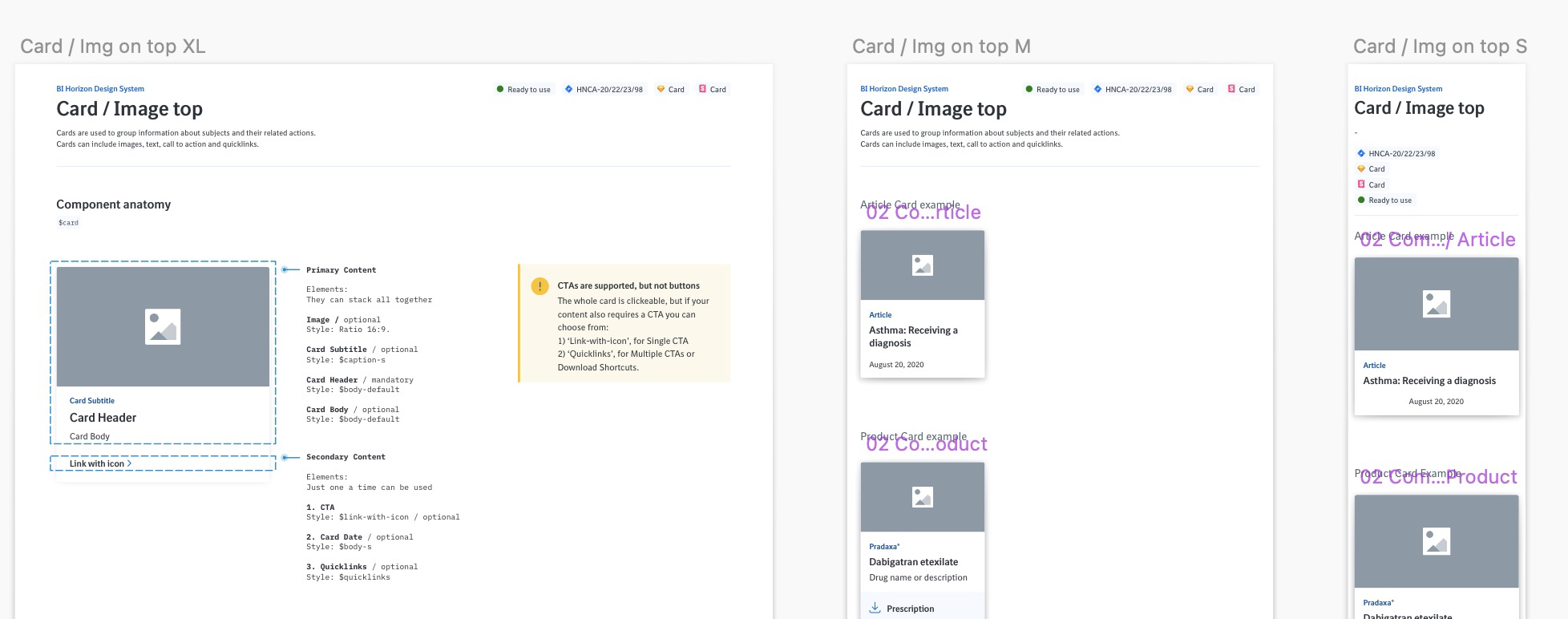
Boehringer Ingelheim released a new design system that needs to be implemented across all of their consumer and healthcare professional (HCP) websites, ensuring consistency and alignment with the brand's updated guidelines.
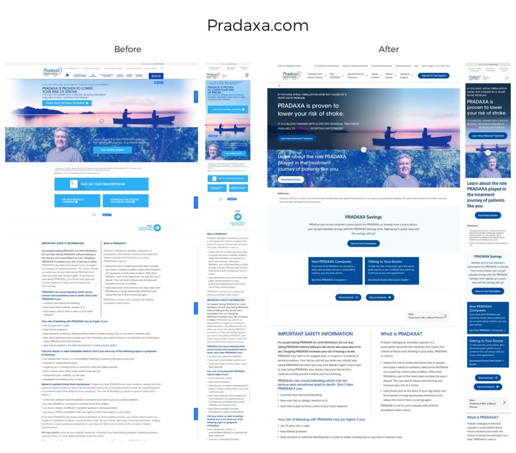
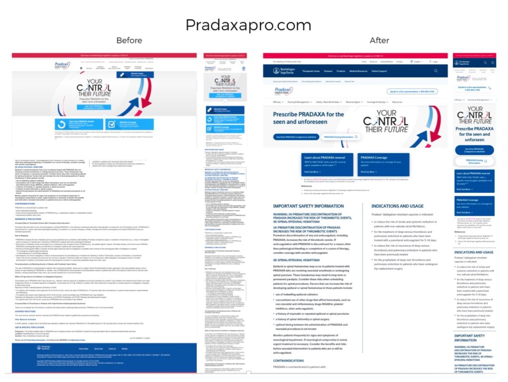
Pradaxa.com / PradaxaHCP.com had unique designs that did not align with the design system.
These two websites were also first to be converted
Outcome
Collaborating with an external agency responsible for the global design system, I successfully implemented the newly released design system across both websites. I provided strategic insights on expanding the component library to better accommodate unique agency requirements and regulatory constraints.
Company
Boehringer Ingelheim
Pradaxa was introduced in 2010 as the first FDA-approved alternative to warfarin to reduce risk of stroke in atrial fibrillation (AFib) not caused by a heart valve problem. The approval was based on a clinical trial that included over 18,000 adult patients. Since then, over 17 million prescriptions for PRADAXA have been filled in the U.S.
Info
Role
Associate Director of User Experience
Team
Me & External Agency Team
Engagement Length
3 months
Tools
Sketch, Screaming Frog SEO
Understanding the problem
Why are we doing this?
1
Business Side
- Consistency Across Products: A design system ensures uniformity in visual language, user interface elements, and interactions across all Boehringer Ingelheim digital platforms. This consistency strengthens the brand identity and delivers a cohesive experience to users, whether they’re interacting with a corporate website, mobile app, or other digital assets.
- Improved Efficiency: Design systems provide a set of reusable components, patterns, and guidelines, streamlining the design and development process. Teams at Boehringer Ingelheim can work faster by using pre-designed elements rather than creating new ones from scratch, reducing duplication of effort and time spent on decision-making.
- Scalability: As Boehringer Ingelheim grows, its digital products and teams become more complex. A design system allows teams to scale design efforts without losing quality or consistency, even as new products or features are introduced.
- Collaboration Across Teams: With a unified design system, Boehringer Ingelheim’s designers, developers, and product managers can communicate more effectively. The system provides a shared vocabulary and set of standards, making cross-team collaboration smoother, reducing misunderstandings, and aligning goals.
- Cost Savings: By standardizing design and development processes, Boehringer Ingelheim can reduce the need for ongoing design tweaks and ad-hoc development work, leading to long-term cost savings.
_
2
Customer Side
- Consistency and Predictability: End users benefit from a consistent experience across platforms. Familiar elements, such as buttons, navigation, and interactions, are present across the brand’s digital ecosystem, making it easier for users to understand and navigate the product.
- Improved Usability: Design systems prioritize user-centered design principles, ensuring that interfaces are intuitive and easy to use. Reusable components are designed with accessibility and functionality in mind, improving the overall usability of products.
- Faster Interactions: With a consistent and well-thought-out design system, users can navigate websites and applications more quickly. They become familiar with the design patterns and can easily predict how to interact with new features or products.
- Better Accessibility: A strong design system includes accessibility standards, making it easier to create products that are usable by all, including people with disabilities. This ensures that all users can engage with digital products in a way that meets their needs.
Approach
Discovery
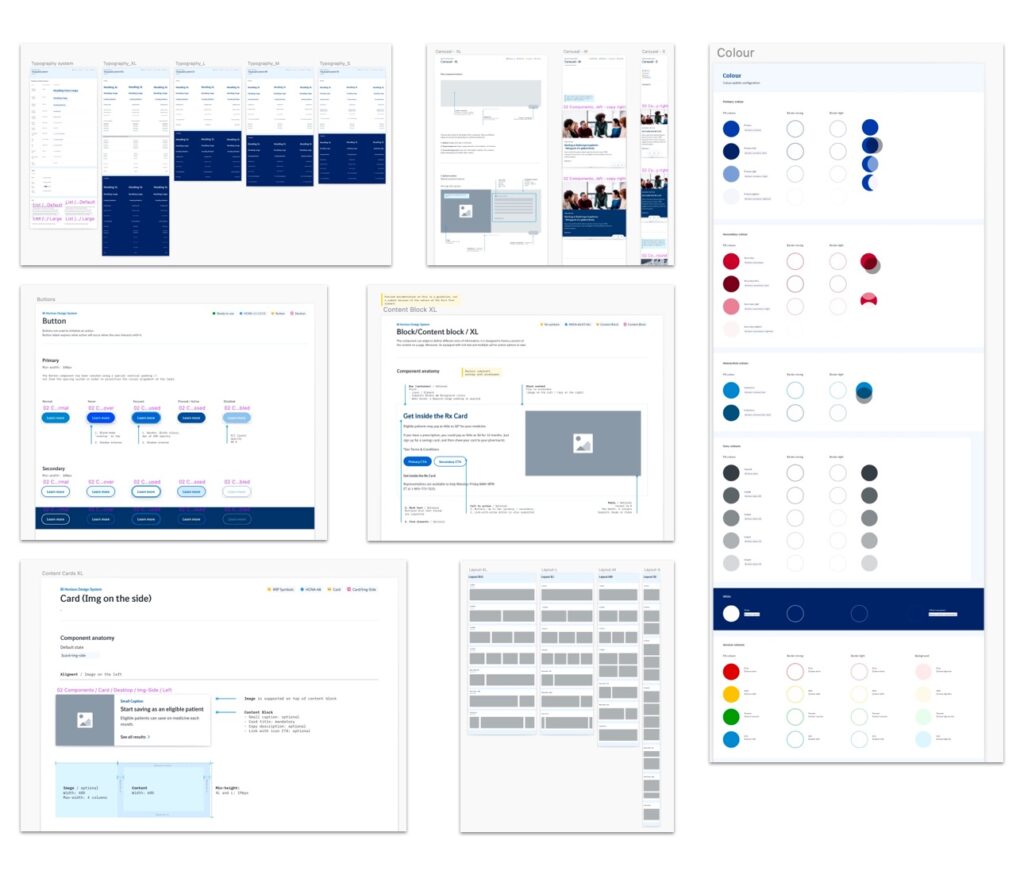
New Design System

Implentation
Theory Meets Reality
The audit was presented to the key stakeholders and laid the groundwork for the conversation to take place. Using Sketch, I've converted all existing assets to the new standard and created a recommendation for the expansion of the Core Library to allow for easy agency adoption & future flexibility.


